Oizom
Helping people explore and understand a smart environmental monitoring platform.
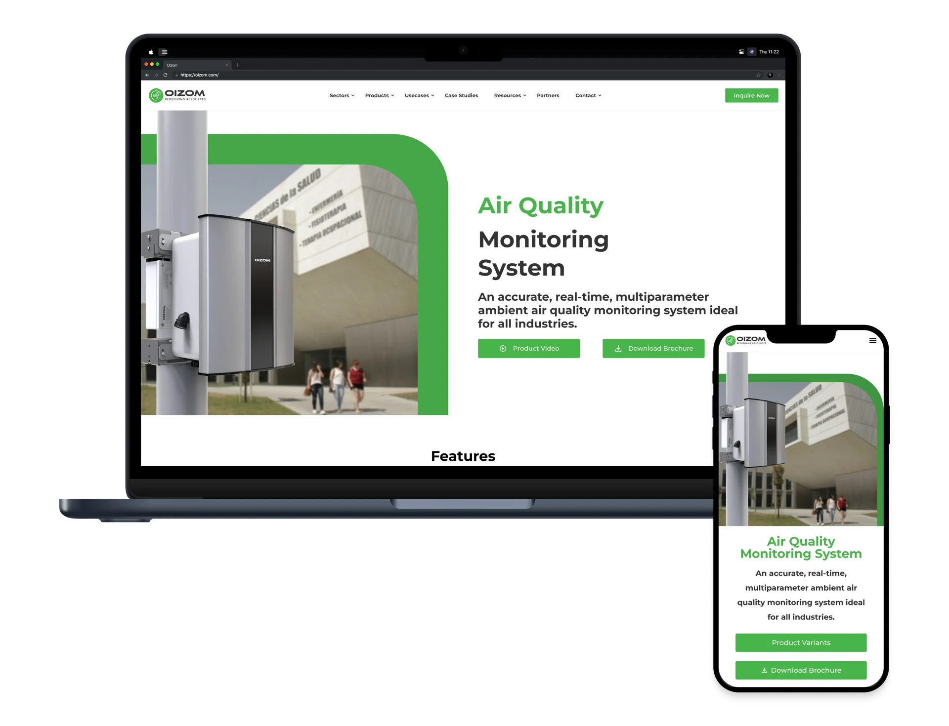
Making complex products easier to explore.
Oizom is a tech-driven environmental company that builds smart, sensor-based systems to monitor air quality and other environmental factors in real time. Their solutions are used by governments, industries, and urban planners to drive data-informed environmental action. Despite having powerful products, Oizom's previous website didn't effectively communicate its impact or innovation.
The redesign aimed to bridge this gap by improving clarity, usability, and visual storytelling. From simplifying complex product layouts to introducing interactive elements and intuitive navigation, the new design transforms the way users engage with Oizom's ecosystem, making it easier to explore, understand, and act on environmental intelligence.
Goals
Clarity
Present complex environmental data in an easy-to-understand format.
Engagement
Use modern, playful UI elements to keep users engaged.
Efficiency
Optimize navigation for a faster, smoother user experience.
Why the Redesign?
Despite Oizom's innovative solutions, its website lacked a seamless user experience, navigation felt cluttered, key information was hard to find, and users struggled to access relevant insights.
- Improve usability and accessibility for diverse user groups.
- Enhance visual storytelling to showcase Oizom's impact effectively.
- Simplify the navigation and content structure for a better user journey.
Consistent patterns across the site.
A few of the interface details used throughout the redesign.
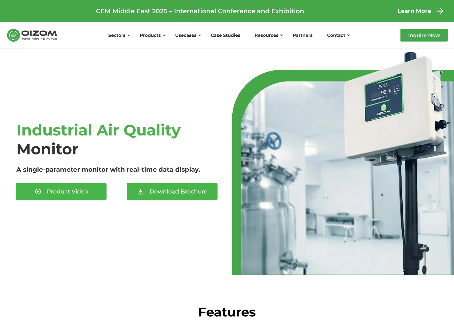
One header across the site
The same navigation groups, spacing and enquiry action carry through the product pages.
Clear primary actions
Green buttons give product videos, brochures and enquiries a consistent visual treatment.
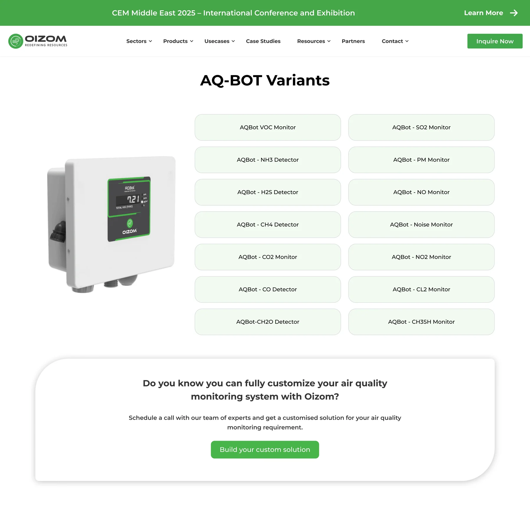
A shared pattern for variants
Repeated card shapes and spacing help people compare the available sensors.
The redesign, side by side.
Compare the original and redesigned interfaces across desktop and mobile.
Oizom Header
The previous header had a dropdown-heavy navigation that made it difficult for users to find key sections efficiently. The lack of visual hierarchy and inconsistent spacing added to the confusion.
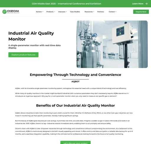
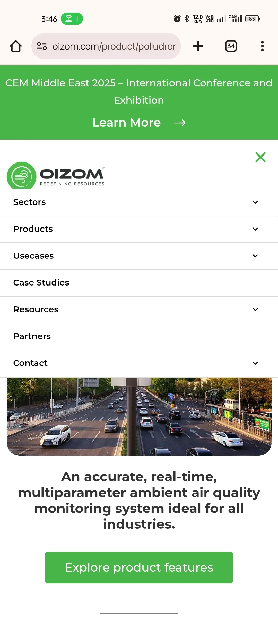
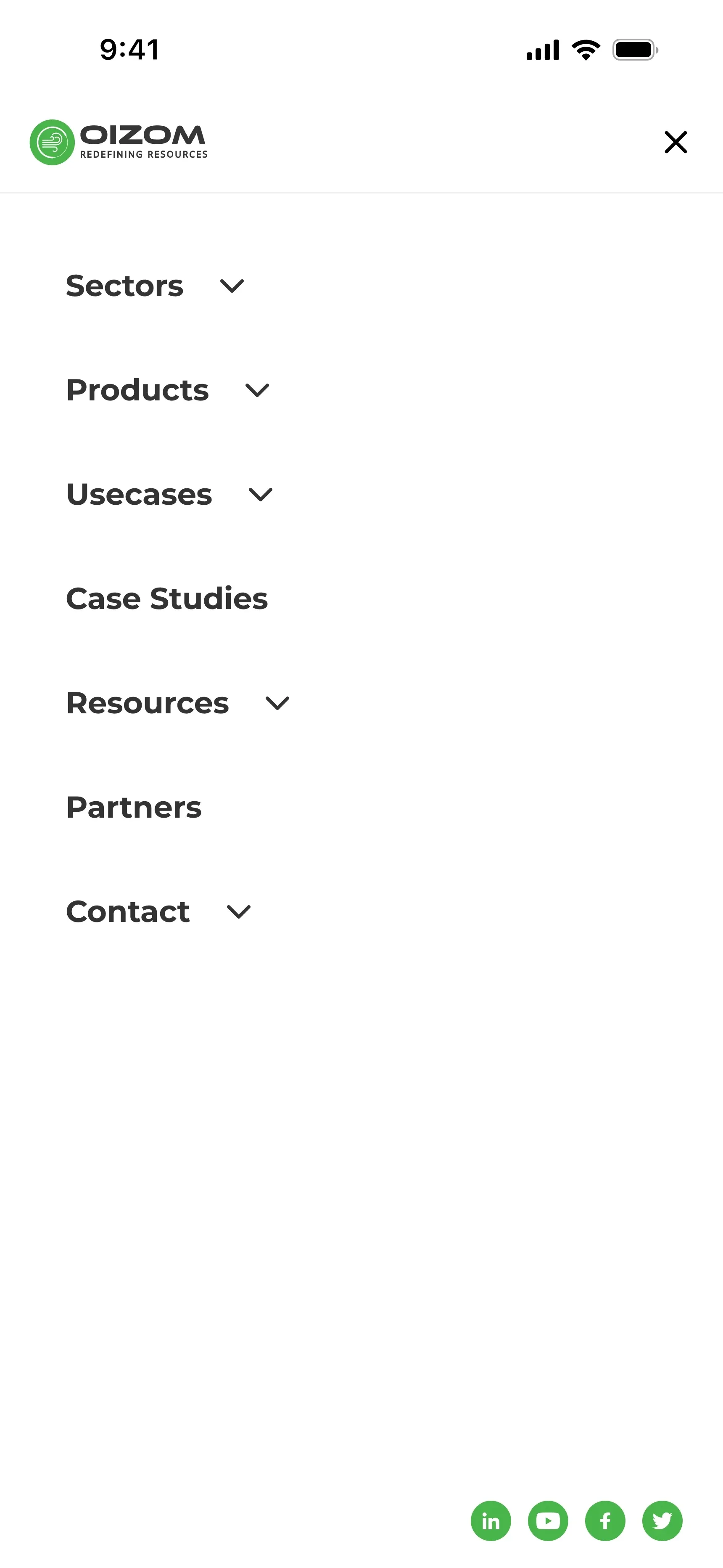
The redesigned header simplifies navigation with a structured layout, clear categories, and an improved dropdown design that enhances discoverability. Icons and better spacing contribute to a more intuitive experience.
Product Variants
The old product variants section was cluttered, making it difficult for users to quickly identify and select the right variant. Without clear distinction or descriptions, decision-making was slow and confusing.
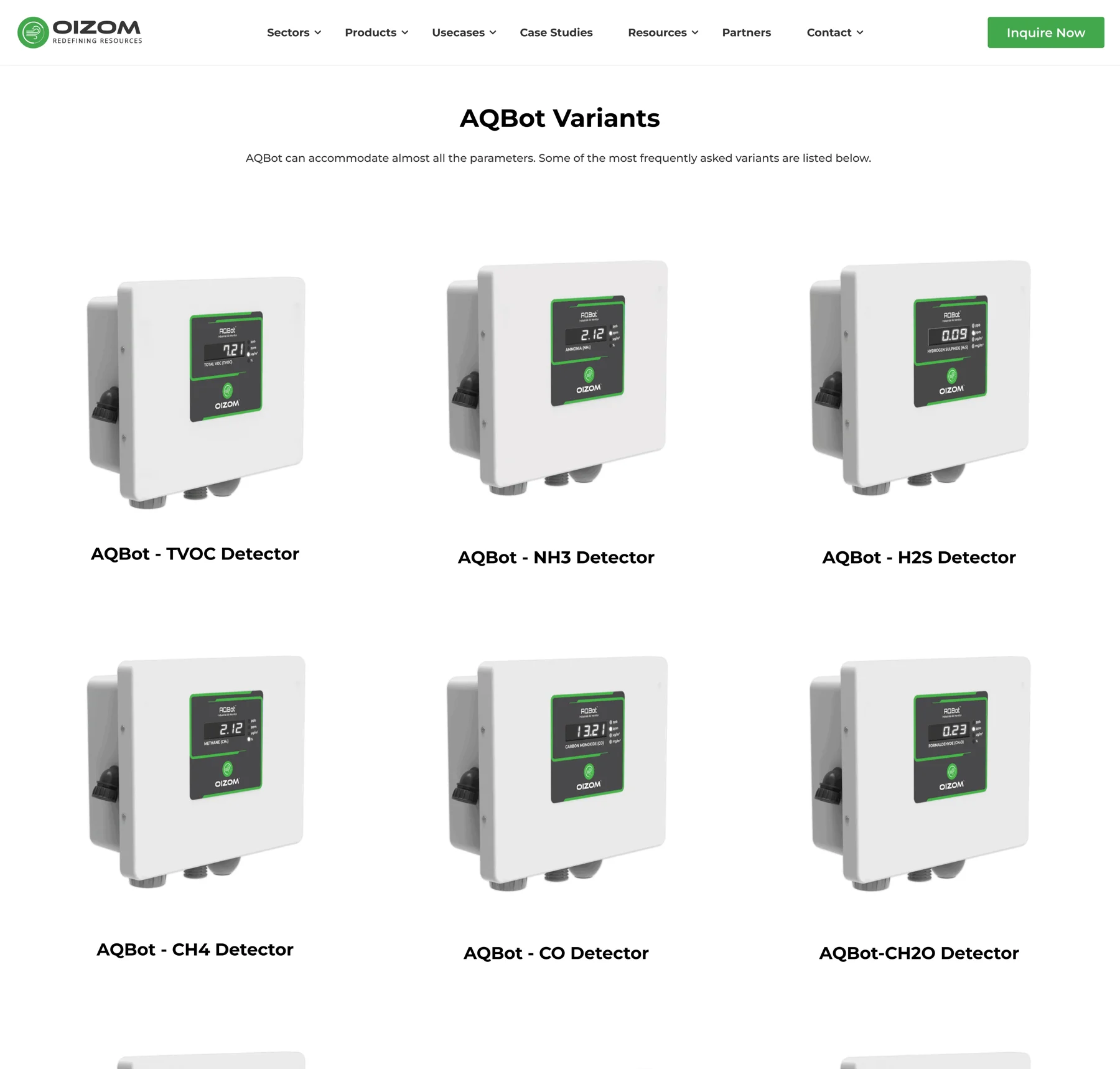
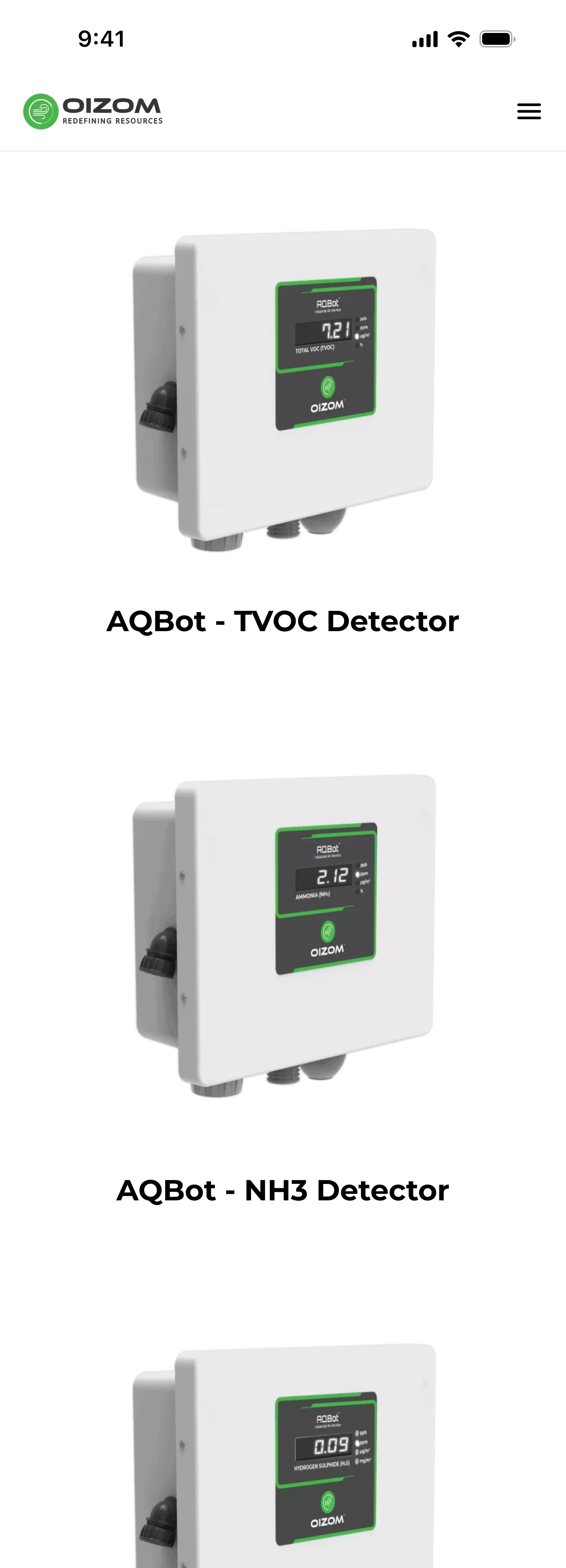
The redesigned product page introduces a structured layout with interactive cards. Hovering a variant name dynamically updates the product image and reveals a brief description, enhancing discovery and simplifying selection.
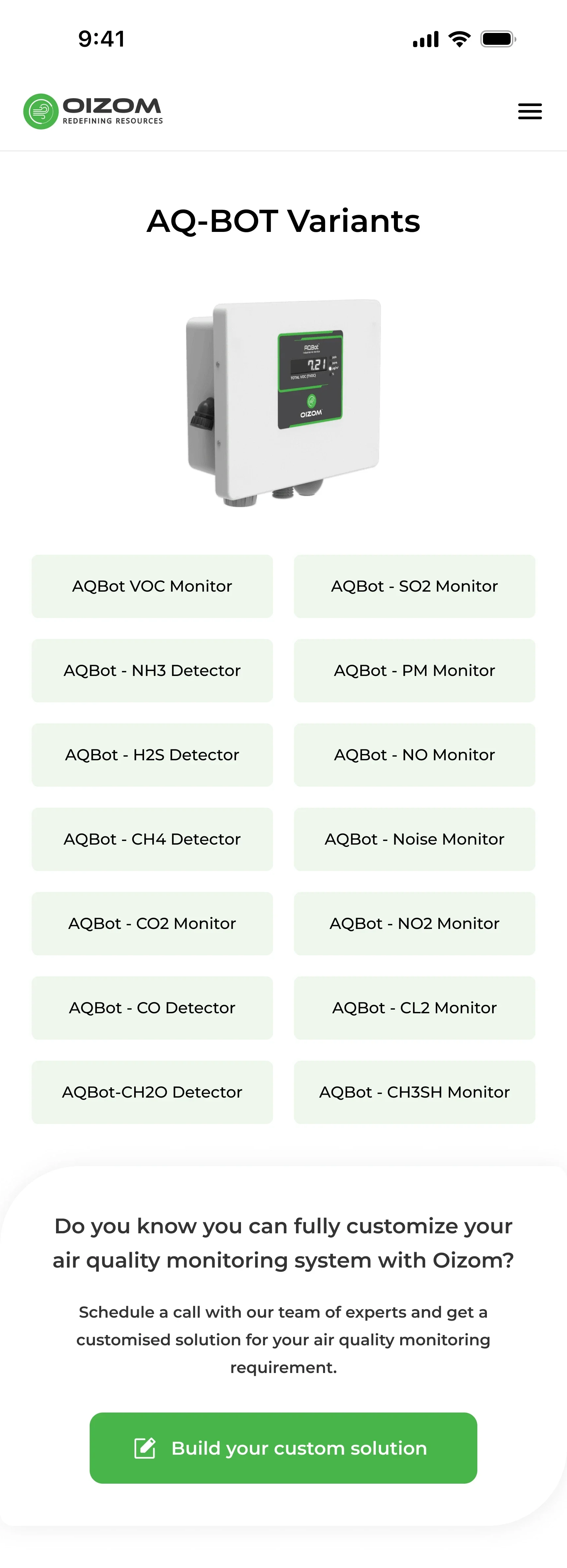
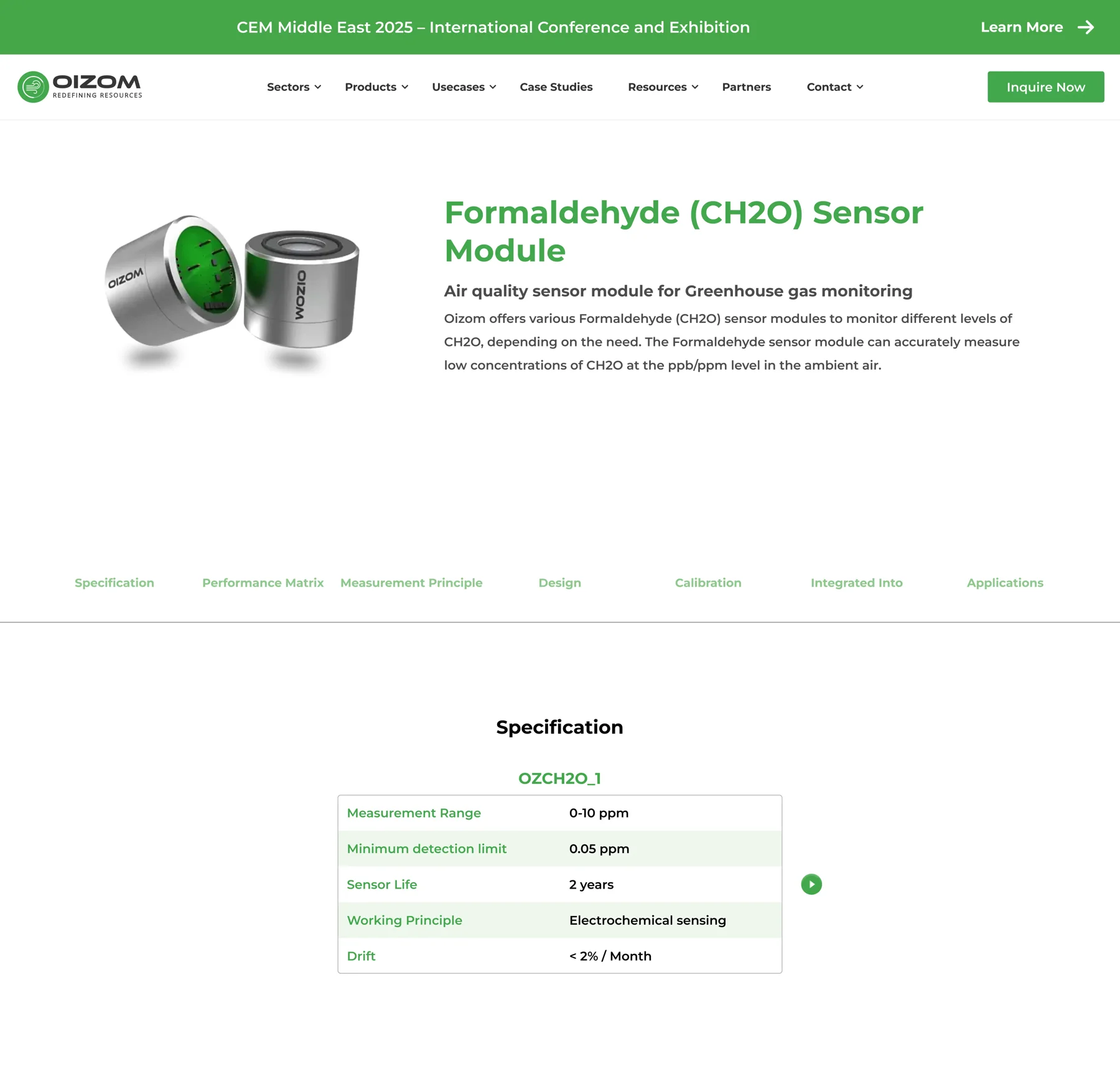
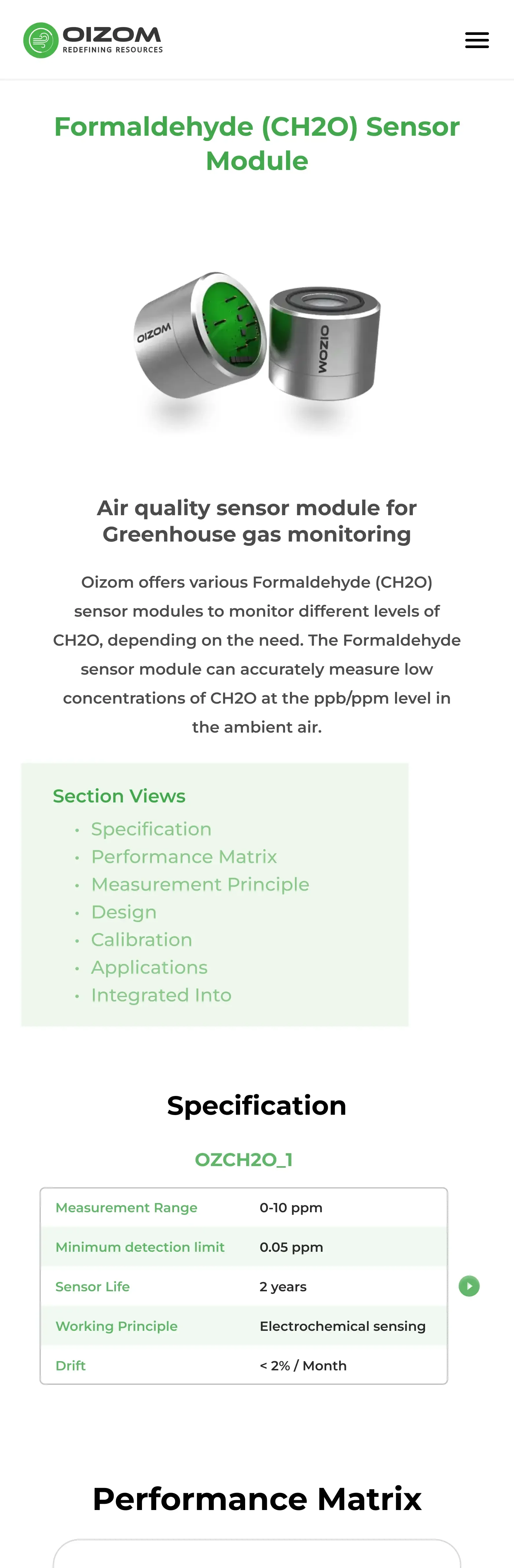
Sensor Module
The previous Sensor Module page packed an overwhelming amount of information into a single section. The lack of structured navigation forced heavy scrolling, and text-heavy images made comprehension difficult.
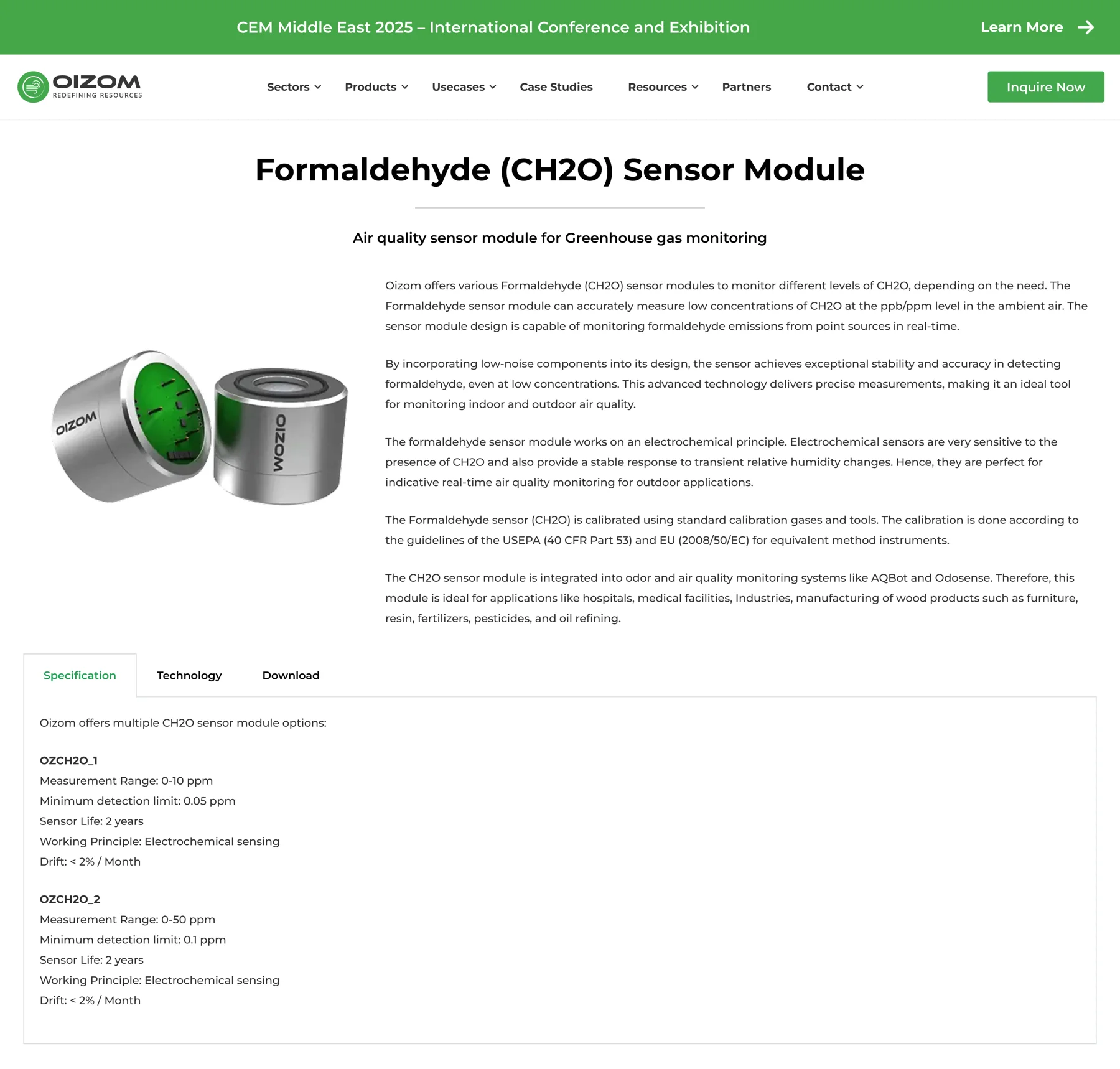
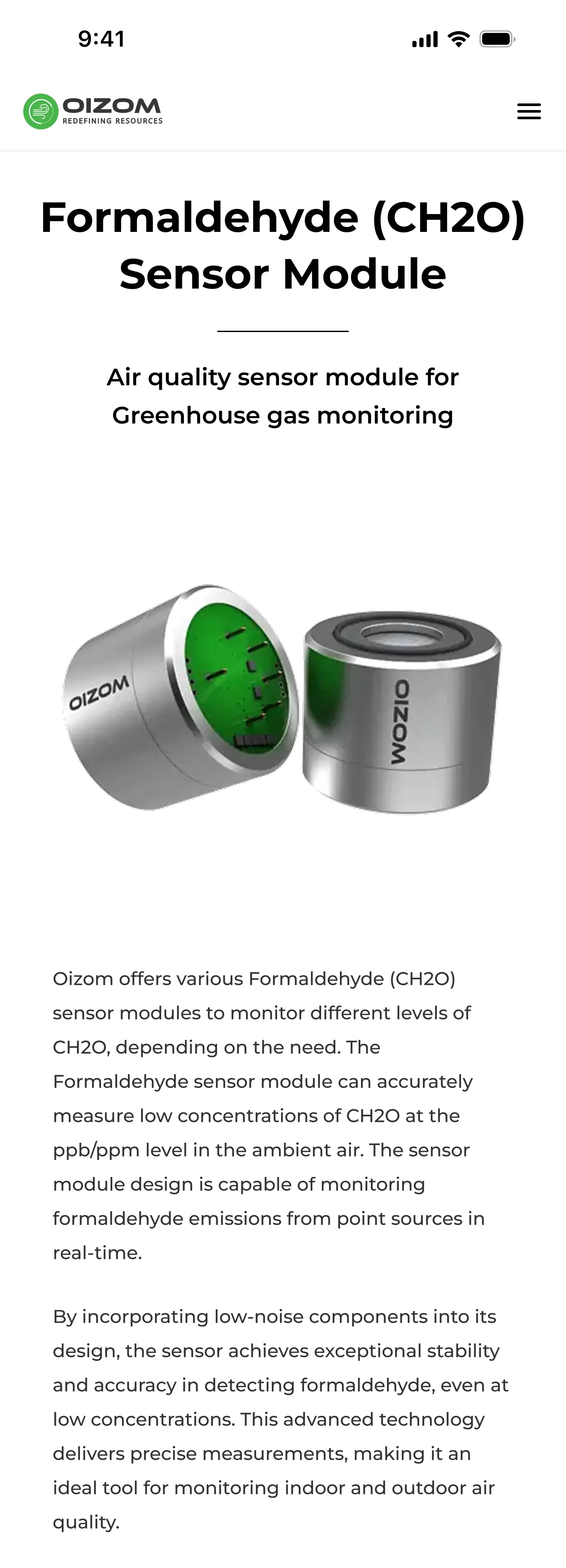
The redesign breaks content into structured sections with clear headings, adds a sticky navigation bar for quick jumps, and uses hover interactions to surface relevant descriptions and images, reducing cognitive load.